Scrobbling Heatmap Calendar
31 Aug 2011
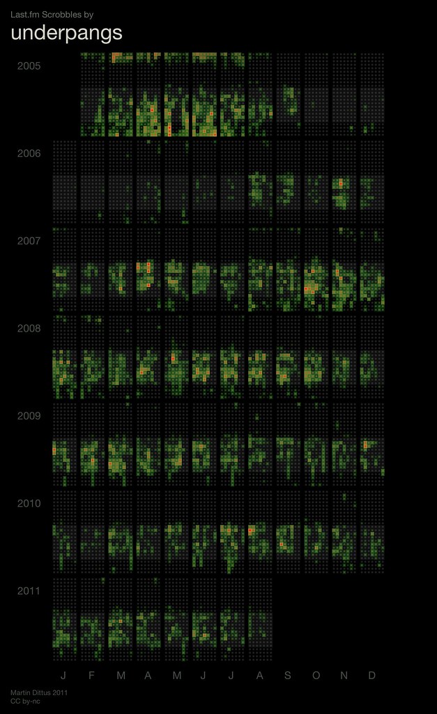
Created by Martin D., one of my ex-colleagues from Last.fm, this is an amazing visualisation of scrobbling activity by year, month, day of the week and even time of day.
They’re manually generated at the moment, with a set for Last.fm staff past and present. The slideshow version is particularly interesting to compare varying peoples listening habits.
Each year of data is arranged in a row and horizontally grouped into 12 blocks, one for each month… Months are organised by an inner grid, where data is arranged in seven columns for the days of week and 24 rows for the hours of day. Weekdays are aggregated so that e.g. all Mondays of a particular month end up in the same column.
Colour is a measure of relative intensity: grey → green → yellow → red. A light grey strip highlights the most active hours of the day across the entire period.
Despite the depth of information it’s stunningly readable and rather interesting. You can pick out real patterns quite easily, as Martin notes;
Frequently people’s graphs are detailed enough to provide a fairly good summary of big life changes. New jobs, busy weekends, holidays, the month when they bought an iPod, or picked up running again, or moved to a different timezone, … I found that showing these graphs to the people portrayed often stimulated interesting conversation about their habits and their choices.
From my graph I was able to spot these behaviours:
- Mid-2005 to 2006 - Finished Uni, got a job and spent the first 6+ months comuting without an iPod after moving to London was still missing a laptop for a long time.
- Late 2007 - An increase in evening listening, a sign of joining the Last.fm team and getting stuck in to startup culture of late nights.
- Early 2008 - Evening listening, but with more separation from daytime listening. I suspect this was nights spent playing albums with my flatmate Ben Ward.
- 2009 - Less evening music, which I think stems from different flat mates, a different flat and starting (an unscrobbled) vinyl collection.
- February 2010 - A quiet month for scrobbling, most of which on holiday in New York, little time for digital music.
